

A good blog is more than a collection of articles. It is a place where readers discover useful information, learn new skills, and find answers to their questions. However, even great content can struggle if a website looks confusing or feels difficult to use.
That is why blog website design matters. A clear layout helps visitors find information, read articles comfortably, and explore more pages. It can also help you build trust with your audience.
The good news is that you do not need advanced coding skills to create a professional blog. With the right layout, simple navigation, readable content, and a consistent visual style, you can build a website that serves your readers well.
In this beginner-friendly guide, you will learn how to design a blog, improve user experience, and make your website easier to navigate.
What Is Blog Website Design?
Blog website design is the process of planning how your blog looks, works, and presents information to visitors.
It includes the layout, colours, fonts, menus, images, buttons, and overall structure of your website. It also covers how easily readers can move between pages and find the content they need.
For example, a well-designed blog usually has a clear homepage, simple navigation, readable articles, and organised categories. Visitors can understand the website’s purpose without spending too much time searching.
Good design is not about adding as many visual effects as possible. Instead, it focuses on making your content easy to find and use.
Why Does Blog Design Matter?
Your website design shapes the first impression visitors have of your blog. When people arrive, they should quickly understand what your website offers and where they can find useful information.
Here are some important benefits of a well-designed blog.
1. It Builds Reader Trust
A clean and consistent website can make your blog feel more professional. Clear headings, working links, readable text, and useful information help visitors feel comfortable exploring your content.
On the other hand, broken links, crowded layouts, and confusing menus can make a website feel neglected.
2. It Improves the Reading Experience
Readers should focus on your content instead of struggling with the layout. Short paragraphs, clear headings, and enough spacing make articles easier to read.
This matters even more when visitors use smartphones or tablets.
3. It Helps Visitors Find More Content
A clear category structure and useful internal links help readers discover related articles. For example, someone reading about keyword research may also want to explore on-page SEO or content planning.
You can connect these articles through relevant links and well-organised categories.
4. It Supports Your SEO Efforts
Website design alone cannot guarantee high search rankings. However, a well-organised website can make pages easier for visitors to use and help search engines discover and understand your content.
Google recommends creating helpful, people-first content and making websites accessible to users and search engines.
Read the Google Search Central SEO Starter Guide to learn more about website structure and SEO basics.
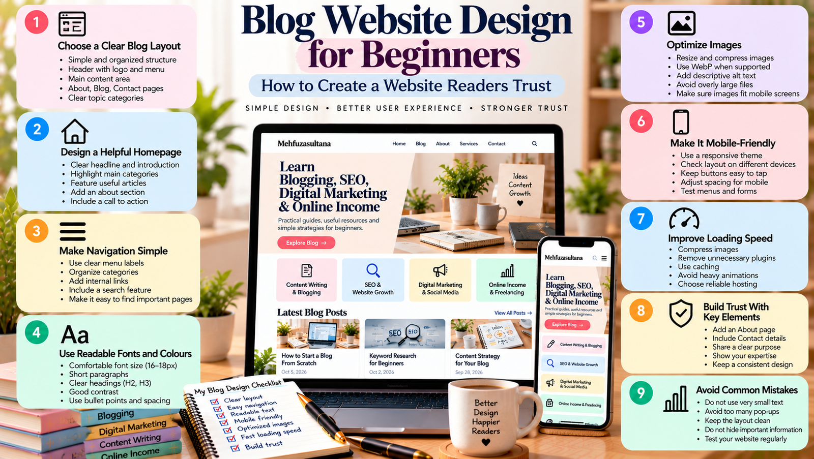
1. Choose a Clear Blog Layout
Your layout determines how visitors see the main parts of your website.
For a beginner blog, keep the structure simple. You do not need a complicated homepage with many sections or decorative elements.
A useful blog layout can include:
- A header with your logo and navigation menu.
- A homepage introduction explaining your website.
- Featured or recent blog posts.
- Clear topic categories.
- A main content area for articles.
- An About page and Contact page.
- A footer with useful links.
Think about your audience before choosing a layout. If your blog teaches SEO, blogging, digital marketing, and online income, organise these topics so readers can explore each subject easily.
Avoid displaying everything on the homepage. Highlight the most important information first and allow visitors to explore the rest through menus and category pages.
2. Design a Homepage That Explains Your Blog
Your homepage is often the first page visitors see. It should explain what your website offers and guide readers towards useful content.
Start with a clear headline that describes your blog’s purpose. Add a short introduction that explains who your content helps.
For example, a beginner-focused marketing blog could introduce its topics with a message about learning SEO, creating better content, and growing an online presence.
Next, include sections that guide visitors through your website:
- Introduction: Explain what readers can learn.
- Main categories: Highlight your core content topics.
- Featured articles: Recommend useful starting points.
- About section: Introduce your website or brand.
- Call to action: Invite visitors to explore articles or subscribe to updates.
Keep the layout organised and avoid adding too many sections without a clear purpose.
For detailed steps, read how to design a homepage that guides visitors.
3. Make Website Navigation Simple
Website navigation helps visitors move between pages. If the menu is confusing, people may struggle to find your most useful content.
Use clear labels that describe what each page contains. For example, labels such as Blog, About, Services, and Contact are easier to understand than vague or creative alternatives.
If your website has several content categories, group related topics together. You can also use breadcrumbs where appropriate to help visitors understand where they are within your website.
Keep these navigation tips in mind:
- Limit the number of main menu items.
- Use clear and familiar labels.
- Make menus work on mobile devices.
- Link to important pages.
- Check that every menu link works.
- Avoid unnecessary menu levels.
Your navigation should help readers reach important information without making them think too hard.
Read website navigation tips for bloggers for more guidance.
4. Choose Readable Fonts and Colours
Your blog’s visual style should support the content, not compete with it.
Choose one clear font for body text and, if needed, another complementary font for headings. Too many font styles can make the website look inconsistent.
Use enough contrast between text and background. For example, dark text on a light background is often comfortable for long articles.
A simple colour palette might include:
- One main brand colour.
- One complementary accent colour.
- A neutral background.
- A readable text colour.
Keep the same visual style across your homepage, articles, buttons, and other pages. This helps create a consistent experience.
Also, make sure your font size and spacing remain comfortable on small screens. A beautiful desktop design is not useful if readers struggle to read the text on a phone.
5. Make Your Blog Mobile-Friendly
Many readers access websites through smartphones. Your blog should therefore adjust to different screen sizes.
A responsive website changes its layout to suit the device. Columns may stack vertically, menus may collapse, and images should fit the available space.
To improve the mobile experience:
- Use a responsive WordPress theme.
- Keep body text readable.
- Make buttons easy to tap.
- Avoid horizontal scrolling.
- Reduce unnecessary pop-ups.
- Check that forms work on mobile.
- Test important pages on a real phone.
If you use Elementor, review its responsive controls for desktop, tablet, and mobile. Adjust spacing, font sizes, and column layouts where necessary.
You can follow this detailed guide on making your blog easier to read on mobile devices.
6. Organise Your Blog Posts and Categories
As your blog grows, organisation becomes increasingly important. Without a clear structure, readers may find it difficult to discover related content.
Create categories that match the main subjects covered by your website. For example, a digital marketing blog could use categories such as Content Writing, SEO, Social Media Marketing, and Online Income.
Each category should have a clear purpose. Avoid creating too many categories with only one or two unrelated posts.
You can also organise related articles into content clusters. A main guide covers a broad topic, while supporting articles explain specific parts in more detail.
For example, a main SEO guide might link to separate articles about keyword research, technical SEO, and internal linking.
This approach gives readers a clearer learning path and helps you plan related content.
7. Use Internal Links to Connect Articles
Internal links connect one page of your website to another. They help readers discover relevant content without returning to the homepage or searching again.
They can also help search engines discover pages and understand how your content relates to other topics.
Add internal links when they genuinely help the reader.
For example, an article about writing blog posts could link to a guide about finding blog topics. A post about website traffic could link to your keyword research resources.
Follow these practices:
- Link to relevant articles.
- Use descriptive anchor text.
- Place links naturally within the content.
- Check that linked pages are available.
- Avoid adding too many links to one paragraph.
A useful internal linking strategy supports both navigation and content discovery. However, every link should have a clear purpose.
8. Improve Website Speed and Performance
Visitors expect pages to load without unnecessary delays. A slow website can make it harder for readers to access your content.
Start by reviewing your images. Large image files can increase loading time, so resize and compress them before uploading.
You can also improve performance by removing unnecessary plugins, reducing excessive animations, using suitable caching, and choosing reliable hosting.
Test your website with Google PageSpeed Insights to identify performance issues and possible improvements.
Do not focus only on the score. Review the recommendations and address the issues that matter most to your visitors.
A lightweight, organised website is often easier to maintain than one filled with unnecessary features.
9. Add Useful Calls to Action
A call to action tells visitors what they can do next. It should be relevant to the page and easy to understand.
For a blog, useful calls to action might include:
- Read the next article.
- Explore a topic category.
- Subscribe to your newsletter.
- View your services.
- Contact you for more information.
Place calls to action where they make sense. For example, you might recommend a related article at the end of a tutorial.
Avoid overwhelming readers with several competing buttons. Choose one main action for each section and make its purpose clear.
10. Build Trust With Essential Pages
A professional blog should help visitors understand who runs the website and how to get in touch.
Consider adding these pages:
About page: Explain your website’s purpose, your experience, and the type of content readers can expect.
Contact page: Provide a simple way for visitors, clients, or collaborators to contact you.
Privacy policy: Explain relevant information about data collection and privacy practices.
Disclosure page: If you publish affiliate links or sponsored content, provide appropriate disclosures.
Keep these pages accurate and update them when your website changes. Do not add claims about qualifications, results, or services that you cannot support.
11. Common Blog Design Mistakes to Avoid
Even a good website can become difficult to use when design choices distract from the content.
Avoid these common mistakes:
- Using too many colours and fonts.
- Adding unnecessary animations.
- Creating complicated navigation menus.
- Publishing articles with long, unbroken paragraphs.
- Uploading oversized images.
- Ignoring mobile layouts.
- Leaving broken links on important pages.
- Adding pop-ups that cover the main content.
- Using inconsistent headings and spacing.
Review your website regularly. Ask someone unfamiliar with your blog to find a specific article or contact page. Their experience may reveal problems you have overlooked.
12. How to Improve Your Blog Design Over Time
You do not need to redesign your entire website at once. Instead, make small improvements based on visitor needs.
Start with your homepage and most popular articles. Check whether readers can understand the content, find related pages, and use the website on mobile devices.
Then review your website analytics, search performance, and visitor feedback where available.
Look for pages that attract visitors but provide a confusing experience. Improve the layout, strengthen relevant internal links, and remove unnecessary distractions.
After making changes, test the pages again. Keep what works and continue improving areas that create problems.
Good blog website design makes it easier for readers to find information, understand your content, and explore your website. You do not need expensive tools or advanced coding skills to create a useful and professional blog.
Start with a clear layout, an informative homepage, simple navigation, readable typography, and a responsive design. Next, organise your articles, connect related pages, improve loading speed, and add useful calls to action.
Most importantly, design your website around your audience rather than following every new design trend.
Your next step: Review your homepage, navigation menu, and one popular blog post. Identify three areas that need improvement and fix them one by one. Small, thoughtful changes can create a better experience for your readers over time.
Add a Comment