

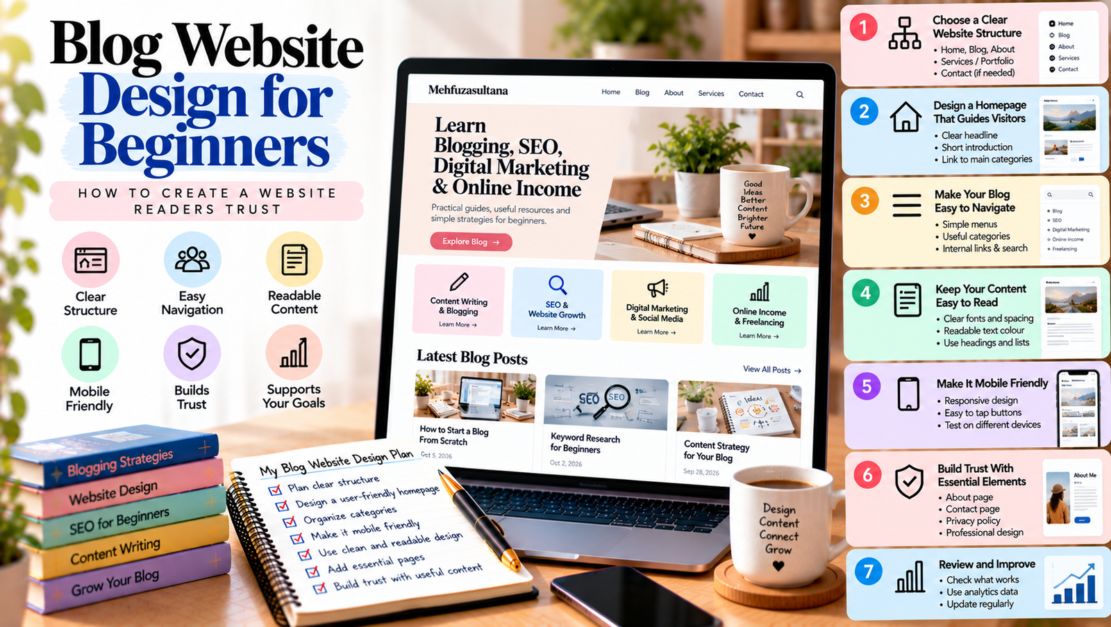
Your blog is more than a collection of articles. It is a place where readers discover your ideas, learn from your experience, and decide whether they want to return. A confusing layout or difficult navigation can make visitors leave before they find the information they need.
Good blog website design helps readers understand your website, explore your content, and take the next step. You do not need an expensive theme or advanced technical skills to create a better experience. A clear layout, readable text, useful navigation, and consistent design can make a meaningful difference.
In this guide, you will learn how to design a beginner-friendly blog website, organize its main pages, improve readability, and build trust with your visitors.
What Is Blog Website Design?
Blog website design is the way your blog looks, feels, and works. It includes your layout, colours, typography, navigation menus, images, buttons, and the way content appears on different devices.
Good design is not only about appearance. It also helps readers find information without confusion.
For example, a visitor should be able to understand what your blog covers, locate relevant articles, and find your contact page without searching through several unrelated menus.
Your design should support your content rather than distract from it. Start with a simple structure and improve it as you learn more about your audience.
Why Does Blog Website Design Matter?
Your website’s design influences how easily people can use it. A clear experience can help readers discover more content and understand your brand.
1. It Makes a Strong First Impression
When someone visits your blog, they quickly look for signs that the website is relevant and trustworthy.
A clear headline, consistent colours, readable text, and organized sections help visitors understand what you offer.
You do not need complicated animations or decorative effects. Focus on presenting your content clearly and professionally.
2. It Helps Readers Find Information
Readers often visit a blog to answer a specific question. If your pages are difficult to navigate, they may leave without finding the right article.
Useful menus, category pages, internal links, and clear headings make your content easier to explore.
3. It Supports Your Website Goals
Your website may need to attract readers, build your personal brand, generate leads, or bring in clients.
Design should support those goals. For example, a freelancer may need a visible portfolio and contact page, while an educational blog may need clear categories and related articles.
Choose your layout based on what visitors need to do, not just what looks attractive.
Step 1: Choose a Clear Website Structure
Before changing colours or fonts, decide how your website should be organized.
Start with a few essential pages:
- Home: Introduces your website and guides visitors to important content.
- Blog: Displays your articles and helps readers browse recent posts.
- About: Explains who you are and what readers can expect.
- Contact: Gives readers, potential clients, or collaborators a way to reach you.
- Services or Portfolio: Shows your work and explains how people can work with you, if relevant.
Your exact structure depends on your goals. A personal brand website may need service pages, while a blog focused on education may prioritize topic categories.
Keep the structure simple. Every important page should have a clear purpose.
Step 2: Design a Homepage That Guides Visitors
Your homepage should quickly answer three questions: What is this website about? Who is it for? Where should visitors go next?
Start with a clear headline that explains your main focus. Add a short introduction that tells visitors what they can learn or find on your website.
Next, guide readers to your main content categories. If you publish about blogging, SEO, digital marketing, and online income, these categories can help visitors choose a relevant starting point.
You can also feature selected articles, introduce your expertise, and include a suitable call to action.
Avoid filling the homepage with every article, widget, animation, and promotional message. Too many competing elements can make the page difficult to understand.
For more detailed advice, read how to design a blog homepage that guides visitors.
Step 3: Make Your Blog Easy to Navigate
Navigation helps readers move between pages and discover related content.
Use a simple main menu with clear labels. Words such as “Blog,” “About,” “Services,” and “Contact” are usually easier to understand than creative labels that do not explain their purpose.
Organize articles into meaningful categories. Avoid creating too many categories with only one or two unrelated posts.
You should also use internal links within articles. When a paragraph mentions a related topic, link to a useful article that explains it in more detail.
For example, a post about writing blog content could link to a guide about keyword research or content planning.
A search feature may also help visitors find specific topics, especially as your website grows.
Learn more in website navigation for bloggers.
Step 4: Make Your Content Easy to Read
Even an attractive website can be difficult to use if the text is hard to read.
Choose a clear font and a comfortable text size. Keep enough space between lines and paragraphs. Use a readable text colour against the background.
Break long articles into sections with descriptive headings. Keep paragraphs focused on one main idea, and use bullet points when they make instructions easier to follow.
Avoid using too many font styles, colours, or decorative effects. Consistency helps readers focus on the information.
Your feature images should also support the article. Choose relevant visuals and make sure they do not push the main content too far down the page.
Step 5: Make Your Blog Mobile-Friendly
Many people browse websites on phones and tablets. Your blog should remain easy to use on smaller screens.
A responsive design adjusts the layout to fit different screen sizes. However, a responsive theme alone does not guarantee a good mobile experience.
Check that your text is readable without zooming. Make sure buttons are easy to tap and menus work properly. Avoid layouts that force visitors to scroll sideways.
Review your images as well. Large images can take up too much screen space or slow down the page if they are not optimized.
Open your website on an actual phone when possible. Test the homepage, blog posts, navigation menu, contact forms, and important buttons.
For a detailed walkthrough, read how to make your blog mobile-friendly and easy to read.
Step 6: Use Consistent Colours, Fonts, and Images
A consistent visual style helps readers recognize your brand.
Choose a small colour palette and use it across headings, buttons, links, and other design elements. Make sure text has enough contrast against its background.
Limit your website to a small number of complementary fonts. For example, you might use one font for headings and another for body text, provided both remain easy to read.
Use images that match your topic and brand. Avoid mixing unrelated visual styles across every page.
You do not need to make every page look identical. Instead, create a consistent design system that allows different types of content to feel connected.
Step 7: Improve Website Speed and Usability
A page that takes too long to load can frustrate visitors. Large images, unnecessary plugins, excessive animations, and poorly configured hosting can contribute to performance problems.
Start by compressing images and using appropriate dimensions. Remove plugins you no longer need, and avoid adding features that do not support your goals.
You can use Google PageSpeed Insights to check page performance and identify possible improvements.
Test important functions after making changes. Your menus, buttons, forms, and links should work as expected.
Remember that speed is only one part of usability. Your website should also be clear, accessible, and easy to navigate.
Step 8: Build Trust With Clear Information
Readers are more likely to trust a website when they can understand who created it and how to contact them.
Add an About page that explains your focus and relevant experience. Provide accurate contact information or a working contact form.
If you publish recommendations, disclose relevant commercial relationships where required. Keep claims about your skills, services, and results honest.
Use consistent formatting and review your articles for broken links or outdated information.
Trust is built through the whole experience. A polished design helps, but useful content and transparent communication matter just as much.
Step 9: Use Calls to Action With a Clear Purpose
A call to action tells visitors what they can do next.
Depending on your goals, you might invite readers to explore a related article, subscribe to your newsletter, view your portfolio, or contact you about a service.
Use clear wording that explains the action. For example, “Read the SEO beginner’s guide” tells visitors more than a vague button labelled “Click here.”
Avoid placing too many calls to action on the same page. Choose the most useful next step for the reader.
Make sure every button leads to the correct destination and works on mobile devices.
Step 10: Review and Improve Your Design Regularly
Your website does not need to be perfect on launch day. Review it regularly and improve areas that create problems for visitors.
Start by checking your most important pages. Look for confusing menus, outdated content, broken links, hard-to-read sections, and unclear calls to action.
Ask a few people to use your website and share where they get stuck. Their feedback may reveal problems you have overlooked.
You can also use website analytics to understand which pages attract visitors and which actions people take. Combine that information with direct usability checks rather than assuming that one metric explains everything.
Make one change at a time when possible. This helps you understand whether the change actually improves the experience.
Common Blog Website Design Mistakes to Avoid
Keep these common mistakes in mind as you improve your site:
- Too many menu items: Visitors may struggle to find important pages.
- Cluttered layouts: Too many banners and widgets compete with the main content.
- Small or low-contrast text: Readers may find articles difficult to read.
- Ignoring mobile users: Menus, buttons, and layouts may work poorly on phones.
- Unnecessary animations: Decorative effects can distract visitors and affect performance.
- Unclear calls to action: Visitors may not know what to do next.
- Outdated information: Old links and inaccurate details can reduce trust.
You can fix these issues gradually. Focus first on problems that prevent readers from finding or understanding your content.
Good blog website design helps visitors understand your website, find useful information, and feel confident exploring your content.
Start with a clear structure, a helpful homepage, simple navigation, readable text, and a mobile-friendly layout. Then improve performance, build trust, and guide visitors toward relevant next steps.
You do not need to redesign everything at once. Make small, practical improvements and review how they affect the reader experience.
The goal is simple: create a website that looks professional, works smoothly, and makes it easy for people to find the content they came for.
[…] For more website design tips, explore our guide on blog website design for beginners. […]